BOLD BLUE, WHITE AND WOOD SHARED BOYS BEDROOM

A new shared boys bedroom reveal is finally here! Welcome to our newest project: a bold blue and white shared kids room with just a touch of natural wood. I love how this fun pattern-filled kid space turned out. This family home is a modern dream, full of amazingly unique features and enough room in here to have two twin beds along a beautiful wall of giant windows peering out into a lush backyard. You will also see that an air conditioning unit is on the main wall and although many online photos don’t show this, I wanted you to see the real look at how to design around this common household item.

The bold patterned blue and white wallpaper covers three of the four walls, adding so much impact to these high ceilings and large windows.

SHOP THE LOOK…

One of the most interesting parts of designing this room was the slanted wall and has to be seen in person to really understand the effect. I’m not sure why this wall was designed this way but we decided to paint it to match the wallpaper on the other walls as wallpapering it would have caused the design to be slanted too! I actually love how well we could match the paint to the paper and I feel like the bold blue wall tones the amount of light in the space a little and brings in a sense of cozy to this large room.

wood dresser with laundry basket and blue wall

The boys are big Star Wars fans and we decided to bring this into the space in subtle ways. We included a nod to Star Wars with this R2-D2 lamp and custom Etsy art above the wood dresser, as well as the adorable pillows too. Having a small bookshelf next to each bed allows ready to grab books for bedtime and an easy spot to put them back too! We loved working with this client and hope the boys enjoy their bedroom for many years to come.

IF YOU LIKED THIS ROOM, YOU MIGHT LIKE THESE ONES TOO…

BLACK AND GREY TEEN BOY ROOM REVEAL

Our very first teen room reveal is here! I’m so excited to share this special space with you and definitely can’t take full credit for this one. Working together with my sister Amanda, we wanted to create a cozy bedroom for her son, my nephew Carter and this project involved bouncing lots of ideas off of each other before deciding on focusing on using pieces that would last him from now into adult life.

SHOP THE LOOK:

Want the truth? This teen boy didn’t exactly love the throw blanket or pretty pillows on his bed but definitely loved the dark grey (Benjamin Moore Kendall Charcoal) shiplap wall and his gaming centre on the other side of the room (not pictured).

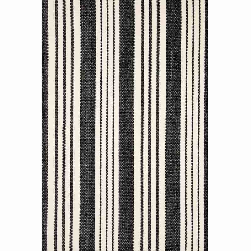
The entire space is pulled together with this bold black and white rug from our favourite line of performance rugs. These rugs are kid proof, teen proof and are even hoseable!

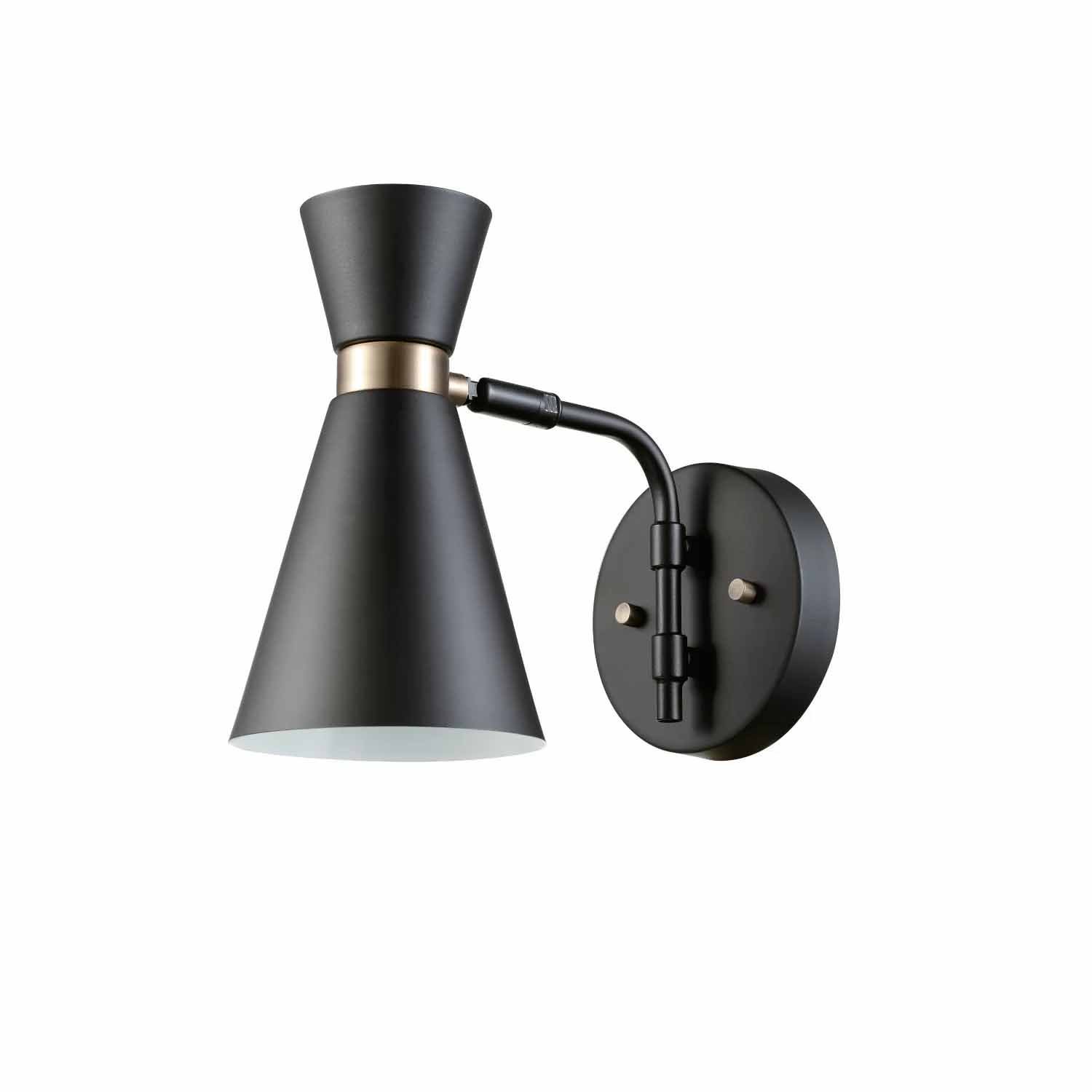
These simple wall sconces free up precious space on the cement bedside tables and provide ambient lighting when the overhead light isn’t needed.

We used a Pointer and Pine flag as art above the bed and this pretty lumbar pillow from Etsy.

RENTAL HOUSE: XAVIER'S NEUTRAL BUNK ROOM REVEAL!

ONE ROOM IS FINALLY DONE and that means it’s time for a room reveal! No surprise that the first completed space is a kids room, because let’s be honest, designing children’s rooms are the most fun of all.

Welcome to our rental home…and my sweet boy, Xavier’s bunk room! This Oeuf bunk bed has been on my list of favourites for what feels like forever and it was the very first piece purchased for his room. There are so many arguments for and against bunk beds, but having had one as a child, I only have the best of memories. Needless to say, the bunk bed made the transition from his old room to this one a dream! He truly loves it just as much as I do.

neutral boy room with oeuf bunk bed

SHOP THE ROOM…

While I wanted this space to feel playful (Xavier plays in his top bunk ALL.THE.TIME), I really feel that for my own kids’ rooms I like them to also feel calm and restful (cue for more sleep please!). With Xavier in Grade 1 this year, it made sense to give him a little desk where he could do quiet activities or a spot to sit and draw.

The wallpaper is by Livette’s Wallpaper and is a removable paper of better quality than any other removable wallpaper I’ve used or seen. It has the best texture, almost like a nice piece of fabric. It is also created using non-toxic materials and inks while also being waterproof and washable! What’s not to love about all of that?! This is the linen colour and pattern is ‘Brushstroke Watercolour’ and I highly, HIGHLY recommend it. Just order a sample and you’ll see what I mean with the quality!

house shaped chalkboard in kids room

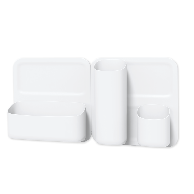
The house shaped chalk board is super cute and Xavier drew this amazing robot himself! The desk is from IKEA and stools are these wooden stools from the play table we used with our children’s playhouse a few years ago. They are now painted white. We love how versatile the magnetic wall sorter (on the left wall above) is and Xavier loves to change up what he keeps in here regularly.

gallery wall above wood dresser
calendar blocks with maileg mice in children’s room

“I love using practical items like this calendar block to teach little ones every day concepts such as the days and months of the year.”

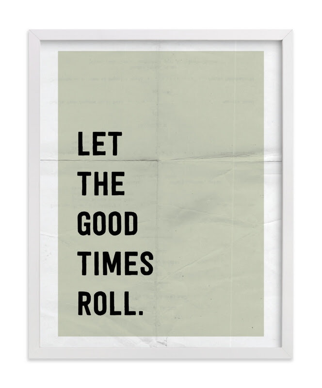
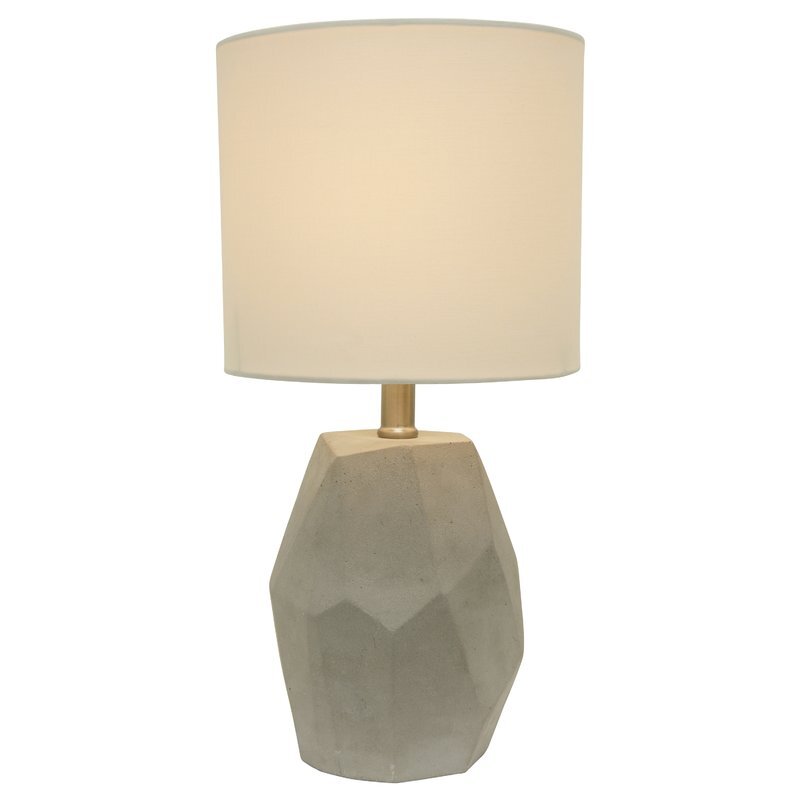
I knew we wanted a good size dresser and one that could last from now until his teen years (if not first apartment!) and this solid dresser is well built and holds a lot. I was trying to decide between a mirror or art and since there wasn’t a lot of space on the other walls for art, it made sense to put a little gallery wall above the dresser for fun here. The sweet sun print is by Emzi Art Shop, the robot print can be found here and the ‘Let the Good Times Roll’ print is from Minted. We decided to put a nightlight bulb in the concrete lamp on the dresser to use for night time but when Xavier gets a little older, we will likely put a wall sconce on the wall next to his bed. So far this solution has worked well so that when it’s time for lights out, he doesn’t just flick the light back on again.

SHOP THE LOOK…

One thing that has added so much softness (and blocks out nearly all the outdoor light!) is the roman shade from Tonic Living. This shade was custom made for the space and is a snug fit on a very basic window. I decided on an inside mount but could have just as easily gone for an outside mount on this wall too. It adds so much softness to the room and the colour (Tuscany Linen, Oatmeal Slub) is the perfect neutral.

oeuf dresser with gallery wall in boys room

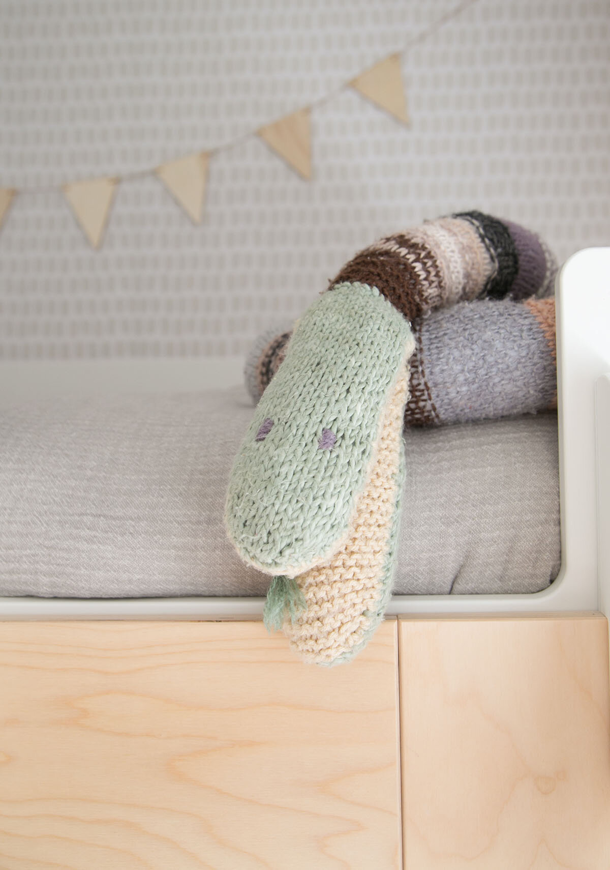
You know how much I love a good book wall and this area with the acrylic shelves creates a pretty cool vignette where you can rotate books just like art. The rug adds a cozy place on the floor to play and is soft underfoot for a wool rug. The knitted snake was handmade by Nana and is a firm fave that we treasure.

acrylic bookshelves in boy room
natti natti floor pillow with book
hand knit snake toy
gallery wall above dresser in children’s room

From the hallway, you have this view of the room and I think it’s one of my favourite views! I love catching glimpses of Xavier sitting at his desk or reading a book on his giant floor pillow from Natti Natti which is handmade in Brooklyn, New York.

neutral kids room with house shaped chalkboard and bunk bed

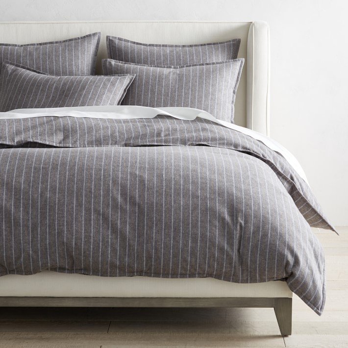
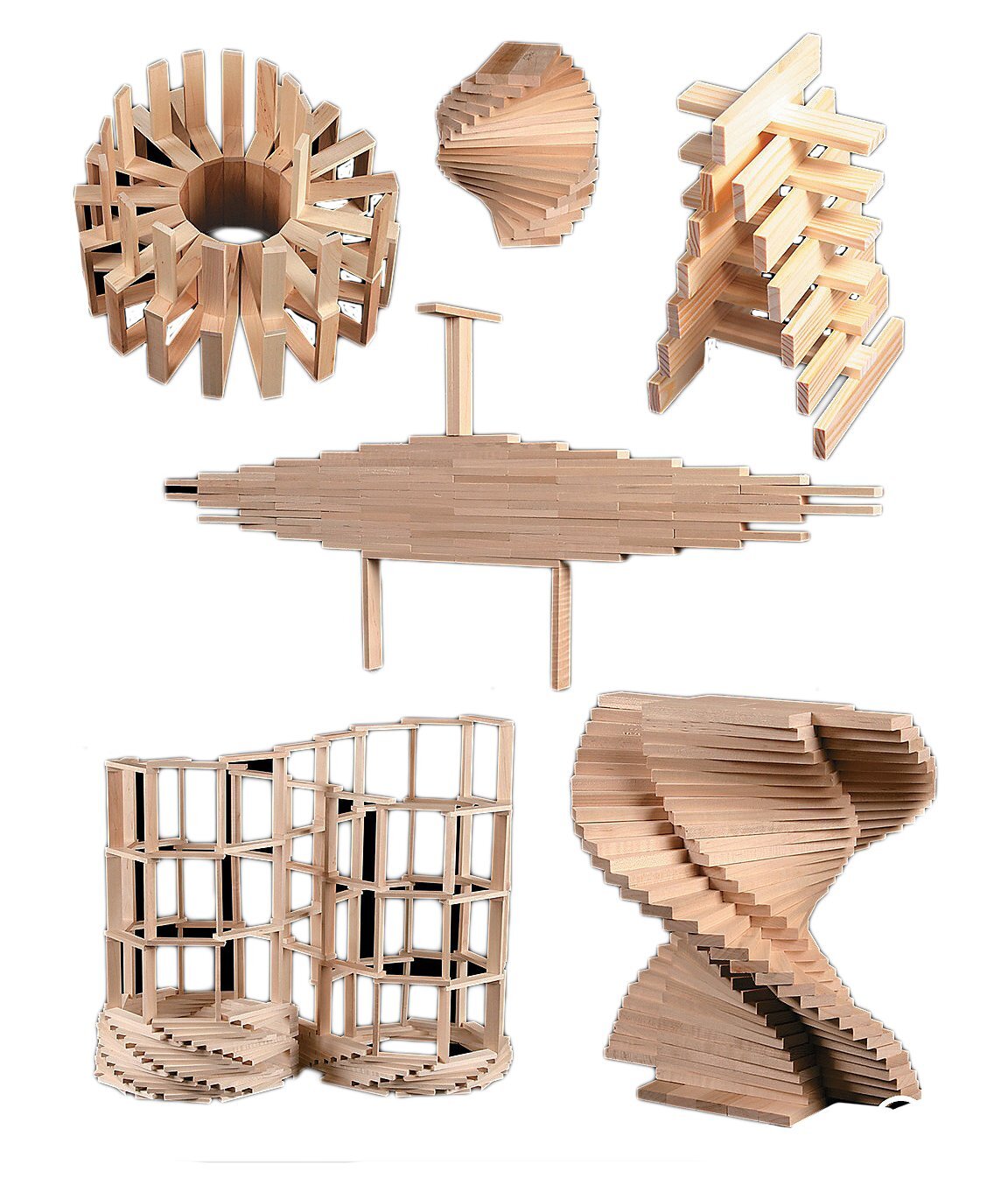
The gorgeous bed linens are 100% linen and from new Canadian brand Dreams Jumper. You can also spot our favourite Cuddle and Kind dolls and Keva building planks.

SHOP THE LOOK…

book wall and bunk bed in boy room
close up of the bedlinen and wallpaper with Cuddle + Kind softie

Although this home is an interim rental for our family, I hope the memories that we make in here will last forever.

*Thank you to many of the brands listed in this post for their collaboration in this project.

YOU MIGHT LIKE THESE POSTS TOO…
XAVIER'S BIG BOY ROOM

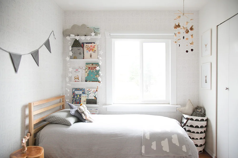
This week marks a major transition for our family; all three kids have started full time school! Overnight, it feels like our youngest, Xavier, is all grown up. In reality, he’s only 5, but it seemed fitting that I share the progression of his baby nursery and how, with some subtle changes, it became his big boy room.

neutral boy room

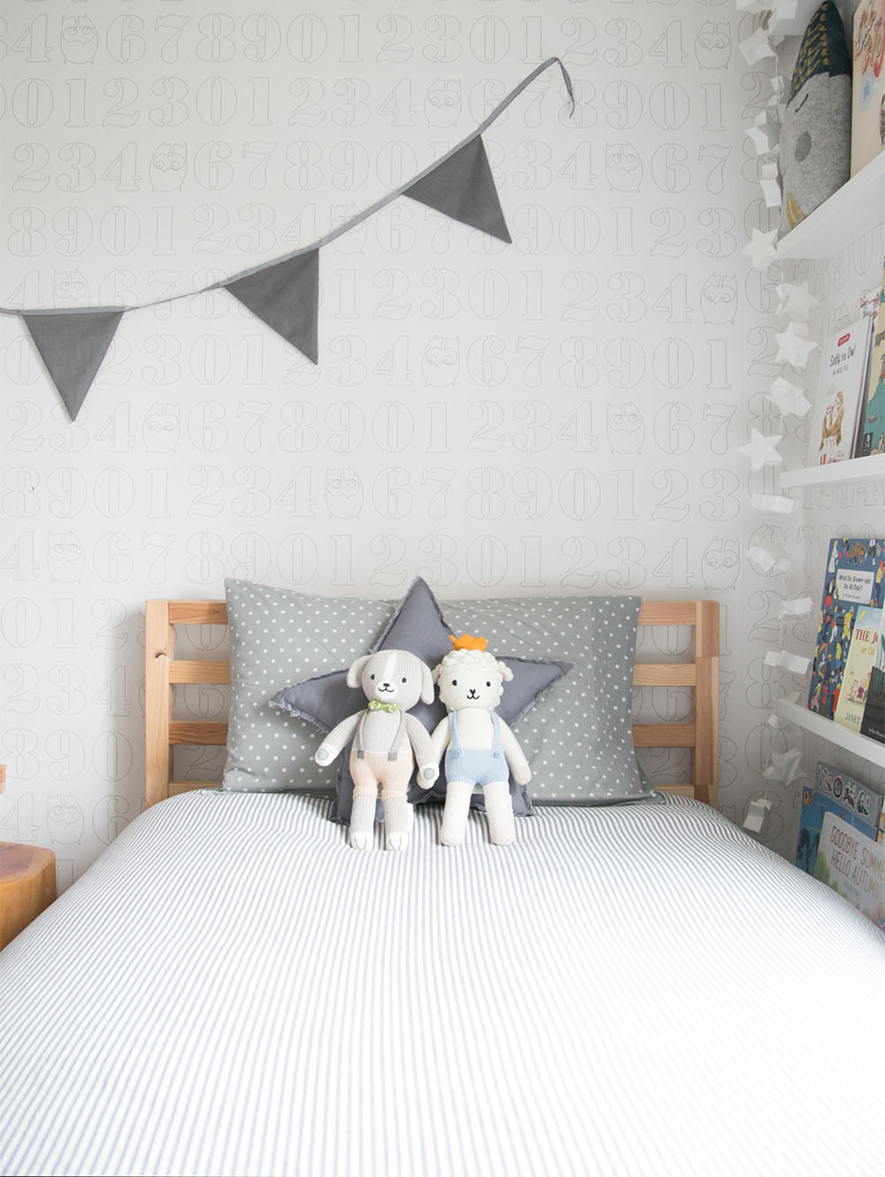
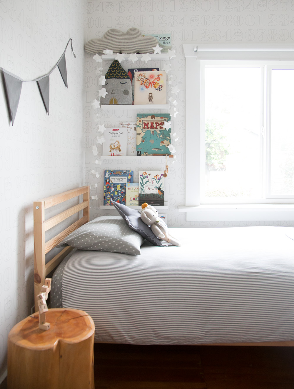
When I chose the wallpaper (no longer available) for this space, I wanted something neutral and sweet enough for a nursery but that could grow with him until early childhood. He still LOVES this numbers paper and has somehow managed not to use it as a colouring sheet! In a few months, we’ll be leaving this home behind and Xavier asked if we’ll be able to take his ‘wrapping paper’ aka wallpaper with him. Sadly, we won’t.

While we won’t be able to take the wallpaper, we’ll be able to take the garland that was made for this room. I love how simple a garland is on the wall and that it transitions so easily from baby to big boy room. I love adding handmade elements to the spaces I design and you can find some of my favourite garlands on Etsy.

Xavier's boy room

These Cuddle and Kind dolls are one of my favourite additions. Not only adorable, this Canadian company donates 10 meals to children in need for every doll sold. I love the heart behind them and the quality is high too.

As you likely already know, I love including book walls in kids rooms. It’s a gorgeous way to display books and creates a unique piece of rotating art that kids adore. I’ve previously shared how to create a book wall in your own kids room using my favourite book ledges.

Xavier's big boy room

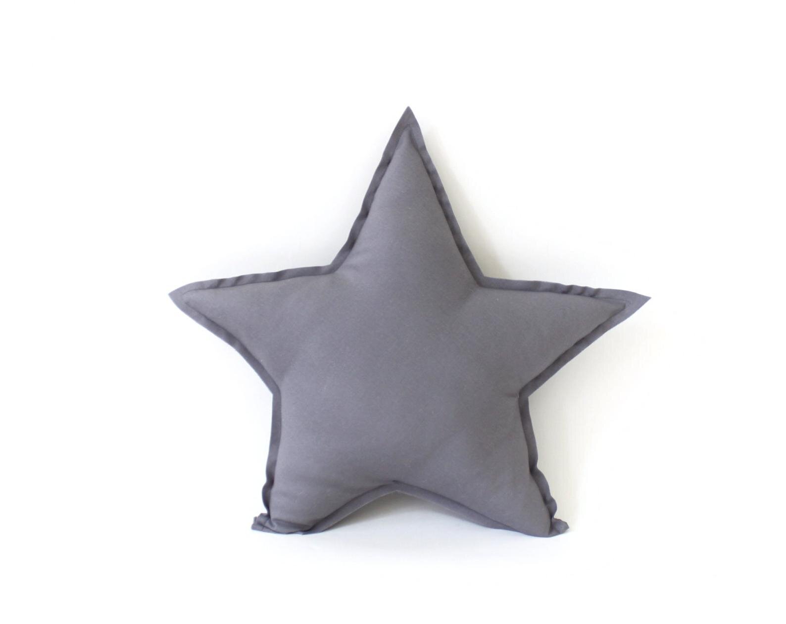
The cloud and house pillows are the same from Xavier’s nursery and the star garland works as his nightlight.

bookwall in boy room
numbers wallpaper and cuddle + kind dolls

MILES' BOHO MONOCHROME NURSERY REVEAL

Our latest room reveal is here!!! I am SO excited to share our newest project, little client Miles' monochrome nursery!!!

This house may look familiar to you; Miles' baby room is right next door to Ella's toddler room (his older sister) that I shared a couple of years ago. 

Monochrome boy room by Vancouver Interior Designer Melissa Barling

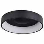
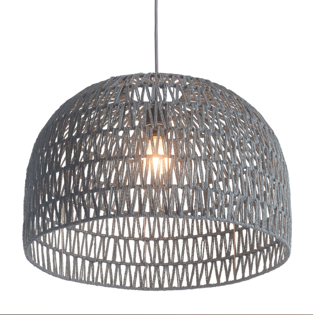
CEILING LIGHT

“I love ceiling lights like this one that still let plenty of light shine through. Install a dimmer switch so you can achieve just the right amount of light desired.”

Boy room with Kalon Studios crib

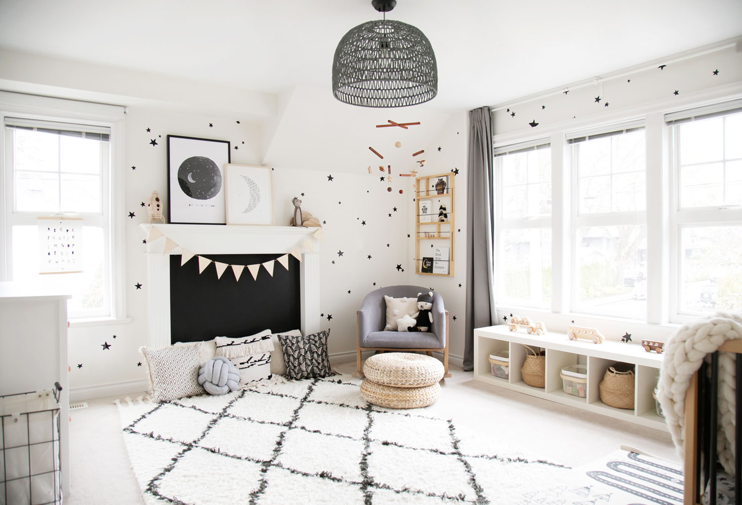
Miles' room is our take on a monochrome boys room. The entire space was based on black and off-white but we wanted to keep the overall feel light and airy with lots of natural wood touches. Stars always feel fitting for a kids room; and this room has nods to space in the 'I love you to the moon' print, the 'dream moon' artwork and the rocket nightlight too. Miles' space is set up to be a dreamy place to sleep but also a perfect place to play.

As Miles started to move, the fireplace became more and more of a point of interest and safety risk. The chalkboard cover (just a piece of plywood painted with chalkboard paint) works perfectly to add such a special detail and covers the fireplace well, keeping little fingers out. I can't wait to hear how much fun he has with this feature when he actually finds out he can draw all over it!

Pillows are perfect for setting up cozy spaces for little ones to relax. I love this knot pillow so much as it not only looks amazing but is lots of fun for babies to grab as well. It functions both as an accessory and toy, which is ideal. Isn't the polar bear adorable too? He's so soft and such a sweet softie to grow up with.

Modern white dresser in boys room

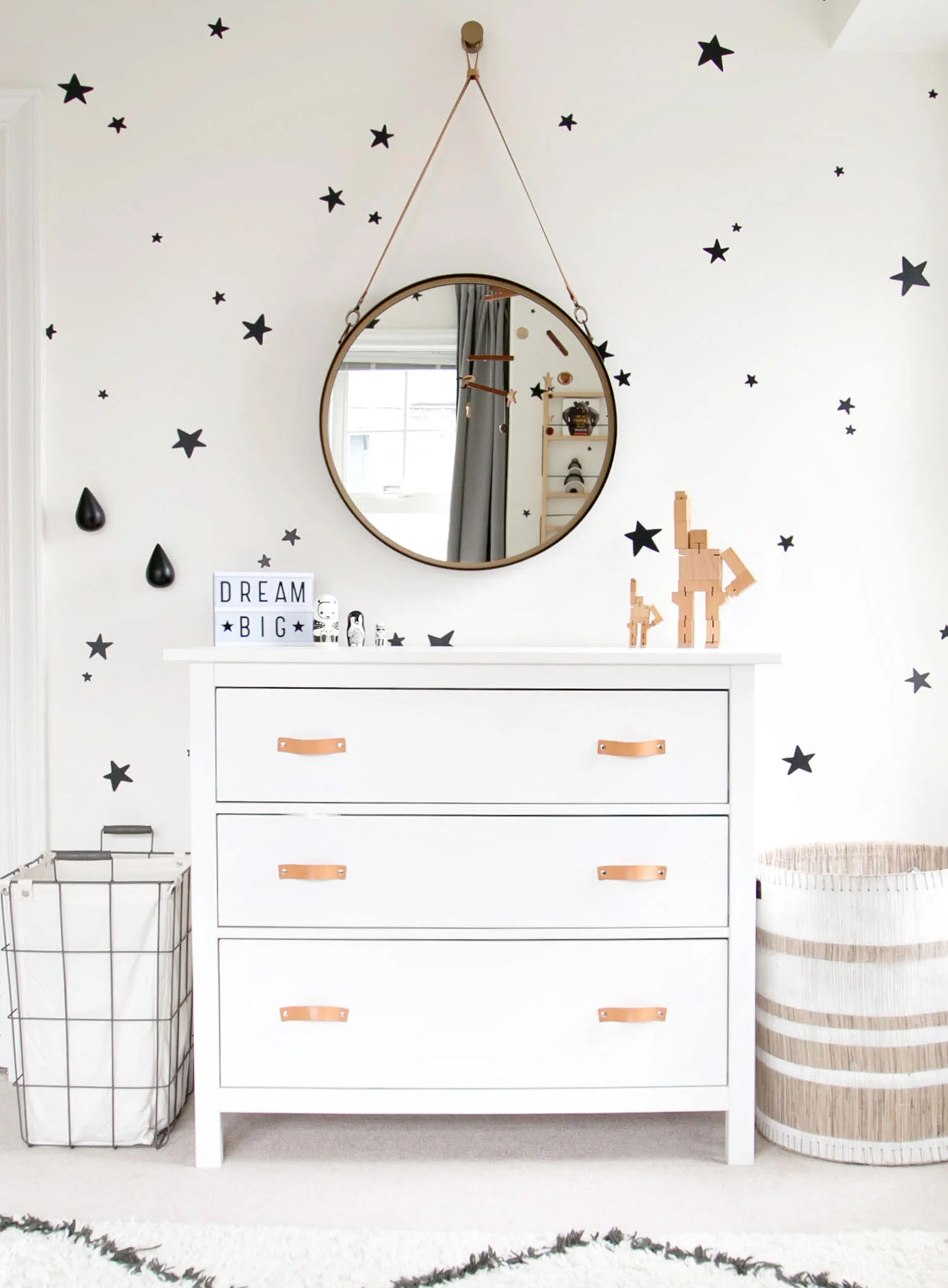
The round mirror over dresser is still one of my favourite set ups for kids. Kids LOVE mirrors and this one will last for so many years to come. I can absolutely see Miles liking this mirror as much as a teenager as his parents do now. Miles' mom didn't want to have a change station as by the stage we designed the nursery, he was wiggling around too much and diaper changes were being done on the floor.

The dresser was an existing IKEA Hemnes one; we simply opted to change the handles to add a special detail that I think adds so much. The leather drawer pulls were found on Etsy.  

I love you to the moon kids art print on fireplace mantel
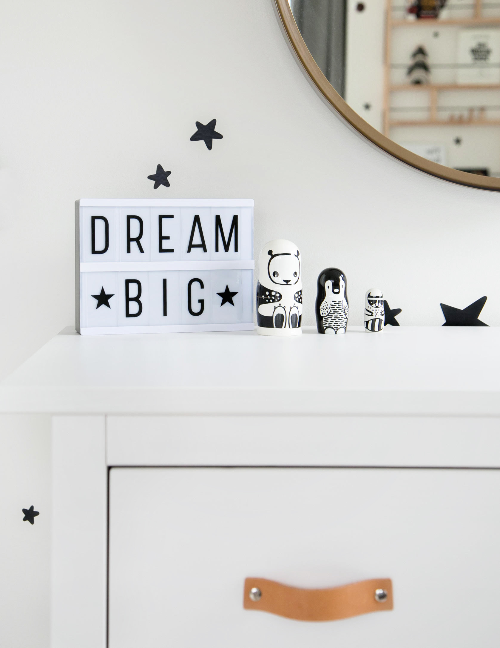
Dream big

I love how small details like the light box and little nesting dolls add a playful touch when decorating kids rooms. The key is using items that are both educational and decorative so (at least) two functions are covered off in one item. 

STAR DECALS

Use decals as a more affordable way to create the look of wallpaper…perfect for kids rooms as you can easily just peel them off as kids grow!

Miles letters above crib

I don't know what side of this nursery is my favourite but the crib corner is sure up there! It's simple but dreamy and the star decals provide all the magic the wall behind the crib needs.

Right under the window is the best little bench for young ones who are just learning to stand. This bench was originally going to be a window seat but as soon as we put the bench there, Miles LOVED it just as it was!!! This is his favourite place to play, pull out toys on his own and look out the windows!

toddler toy bench

SHOP THE LOOK…

For those who like to see what the room looked like before, here is a photo of the space when I first arrived. It's always amazing to look back on where we started!

before of the room
star decals with star hooks

Just like in sister Ella's room, Miles' mama wanted a little shelf with hooks beneath it right by the door. It is such a functional set up for providing a landing place for sweaters, etc. when you walk in the room and helps to keep the space tidy.

reading corner in boys room

Miles sure is one lucky little babe! Rooms like this are such a dream to create and knowing that he will grow up with memories of his time here is the absolute best part. 


YOU MIGHT LIKE THESE POSTS TOO...