Big sigh. Okay. Sharing our rental house has been a looong time coming, mainly because, well…I don’t feel it’s ‘professional’ enough. It’s definitely not my usual type of work, but since last October, home has come to front of mind as an even more important place for our family. When my brother-in-law passed away, the only place we all wanted to be was at home; safe and comfortable with the people we love most and it reminded me of the real importance of our homes in good times and especially bad. That wherever we are, making it feel cosy and safe are truly all that matters.
Fast forward a few months and here we ALL are…spending more time (than we possibly ever wanted to!) at home amidst the COVID-19 pandemic. This feels like the perfect time to share what our rental house looks like, and the progress and transformation of this place we now call home.
FACT: our rental house is hardly my dream house. That being said, I am IMMENSELY grateful, especially right now, that we have a house and a small yard to live in. We are insanely fortunate and I understand that. We were hopeful to be in this house for only a year (looking to buy) and I could see that with some simple changes, this house could become a place we call home for the time we spend here. We are now going to be here a little (or a lot longer)…
The extra time we are spending at home has really refreshed the ‘why’. Why I love to create special spaces, why I want to inspire organized, intentional living, why I love adventures (even creating them at home) with my family and why I want to continue building memories for our kiddos; whether it be through making our home happy or creating beautiful spaces for others and yes, of course, sharing everyday moments that I hope they will fondly remember. This is our life and we only have one shot to make it all we ever dreamed of!
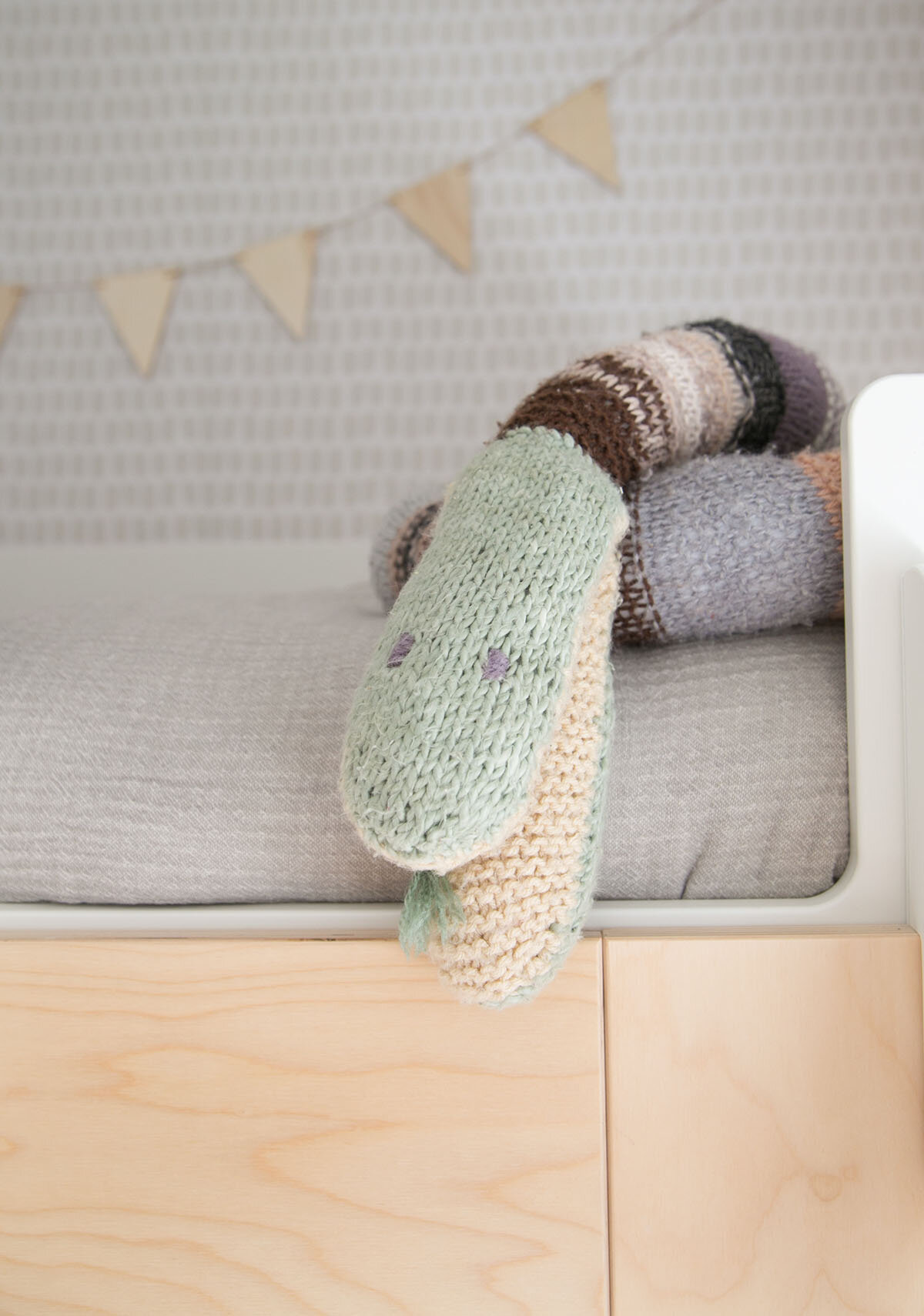
So, in the spirit of sharing more of the real stuff this year…I’m starting with the before’s of this house and will gradually be sharing the afters along with some of the process along the way. The only room I’ve shared so far is Xavier’s bunk room (above) and it’s the only one in the house that is completely done (until now!).
So, here’s to sharing progress on this house (with you along for the ride!) because there is simply no time to wait for perfection. Now is the time to enjoy making memories wherever we are (#dontwait)!
Are you ready? The before’s are unlike anything you’ve seen here before.
Let’s start in the room that made me think there was possibility in this house…the living room! This living room has beautiful original windows and I was able to peel back the carpet to see that original hardwood sits right underneath. One tick in the right direction. That fireplace is a serious eyesore and the curtains make the ceilings appear so much lower than they need to. Hopefully this can all be changed.
Next up, the dining room. Good light (especially with the one working light bulb, ha!), a messy floor plan but liveable and will fit our dining table (we eat every meal at home at our table). Downside is that there are four (yes, 4!) entries to this room…which is obviously less than ideal, but we can deal with that. It will work.
The girls’ room (below left). You can visible see how optimistic one is and how deeply peeved the other one is. Eek. I kinda love this photo. None of us were super excited to move from our old house, but I know the end result will be worth the wait (next house a dream home I hope!) and in the meantime, we’ll make the very best of the basic room that this is. This is the next room that I’ll be sharing here on the blog, coming next week.
Okay…so, a few changes are in progress in the room pictured top right. I don’t even know what to call it. It is warped (floors, ceiling, walls) and just the most bizarre random extension but I can’t help to see its’ potential!!! It’s south facing (where that epic sailor wheel is) and east facing (where the other windows are) so gets a lot of morning light. This room has seen a lot of changes, from my happy office, to now the new school room (in an absolutely thrown together way) . Since the kids are all off school, we have had to transition this space into a room that they can be happy and productive in, especially in the mornings when they do the most of their school work.
I’m not going to lie, I really can’t believe I’m about to share these next rooms on my blog. I have NEVER shared spaces as rough as this, but hey…do you see what I see?
If you are new around here, you may not know that we had a kids’ art space in our last house and it was one of the most used rooms in the entire house. Our kids love to create art and I am determined to turn this basement space into something that resembles a fun art room.
On the right…the bathroom. Yup, this is it. When my husband saw this room, he simply declared, “we can’t live here”. But trust me with this - it won’t be a GREAT bathroom, but I am sure it can be clean and functional.
Below is ‘the laundry room’. Basically a basement dungeon, right? Stick with me. There is some odd film on the windows and I know paint will make this presentable, but still…not sure I can make this into blog material. Let’s see.
This little spot needed to become something. When we first moved in, we hung some hooks and it became a collection area for coats, shoes and generally everything! It was a mess. I can see it as a little book nook so will work on that!
Over the coming weeks, I will share how things are going and the updates to this house here on the blog. If you want to follow along with some of the behind the scenes, come follow me on Instagram under the hashtag #winterdaisyrentalhouse for even more fun!


